Thursday, March 29, 2012

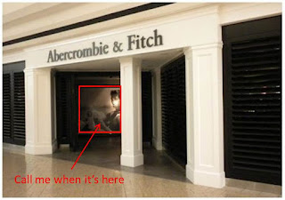
Abercrombie & Fitch (Finally) Gets Gay?


Ooh, la, la!

Attending high school at the turn of the Millennium meant waiting with bated breath for the arrival of Abercrombie’s Quarterly Catalog – (at least for me).

Abercrombie was THE must-have brand if you were to have any chance of being popular. No longer the case, from what I can gather with my limited exposure to today’s teens in-the-know.

Losing Their Mojo…

So Abercrombie killed their catalog in 2002 after four states threatened legal action over its lewd content. And although in-store advertising continued to feature scantily clad 20-somethings with perfectly chiseled bodies, much of the publicity and chatter around the brand died with Quarterly.

Aside from the occasional mild drama that arose from t-shirts with double-entendres gone too far, the brand faded into the background.

Why Abercrombie holds far less clout on today’s playground:

I blame a product/demographic miss-match. Teenagers buy clothes based on trend - what’s new and now. Abercrombie designs clothes based on building an enduring, iconic brand – consistent and unchanged. So while competing teen clothiers like Express, Forever 21 and the like stay afloat by capitalizing on quick-moving fads, Abercrombie spits out more of the same. They are the Ralph Lauren of teen apparel and that’s simply not how teens like to buy clothes.

But, there are certain universals that never go out of style – especially with rebellious teens.

Sex and controversy always sells (and Abercrombie & Fitch needs all the sales it can get).

And so, A&F returns to the scene – bar rose. We’ve been teased for years with homoerotic images and now finally, Abercrombie is injecting a little male-on-male romance into one of its marketing campaigns.

“Other Sports Require One Ball” is a video campaign shot by famed photographer Bruce Weber, (view the ad here).


Although I doubt images from this shoot will ever grace the larger-than-life frame that sits at the front of each A&F outlets, it is great to see the brand giving a bit of a nod to the lifestyle of so many store regulars.

It only took year-after-year of same-store declining sales and a bout with irrelevancy, but we’ll take it. :)
Wednesday, March 28, 2012

Should Skittles and Arizona Iced Tea Feel Financially Obligated?


I’m sorry, but no.

While much of the United States and the African American community in particular remain outraged in the lack of justice having yet to be served in the Trayvon Martin case, Skittles and Arizona Iced Tea find themselves in an unusual and particularly sticky spot.

For those unfamiliar with the connection, on Feb. 26 the 17 year-old was returning home from a convenience store where he had purchased Skittles and an Arizona Iced Tea when he was shot to death by George Zimmerman, a volunteer neighborhood watchmen.  

Was Trayvon aggressor or victim? Was Zimmerman acting in self-defense or on preconceived notions based on racial stereotypes?

At present, there is little evidence available and conflicting narratives from both sides of the controversy. The killing has sparked a national dialogue on race.

Now, this is a Marketing blog and that’s it. Let’s just stick to what we know.
As the case heats up, social media chatter around Skittles and Arizona Iced Tea has as well – and of course, not in a particularly favorable way.

More recently, individuals have begun demanding that the two companies comment on the controversy, even pony-up money for the Martin family. People are using Twitter and Facebook to share and show their alleged ‘uniformity’ in boycotting the brands should they not take action. Bullying, anyone!?

The companies have already expressed their condolences to the Martin family, both commenting that it would be “inappropriate” for them to get involved further. I couldn’t agree more. To expect Skittles or Arizona to pay up is to say they share in the blame.

The sad reality of the world is that people are killed every day. While this story has caught national attention and is particularly devastating in both how it unfolded and the wider implications in racial profiling, Skittles and Arizona Iced Tea are inconsequential.  Any product/brand could have been purchased prior to the event, (and none would want to be associated with such a tragedy). To say that they are profiting from free publicity associated with the controversy is frivolous.

Social Media has increasingly become a platform for bullying (and it’s got to stop).

We’ve said it before; Social Media makes spouting off too easy. We Americans are so bored with the predictability and drudgery of our daily lives that we jump on any opportunity to off blow steam. Attacking someone via Twitter, like honking or flipping the bird in traffic, provides a veil of anonymity that permits us to act more brazenly than we might otherwise do face to face. It doesn’t justify it.

What do you think?

Should Skittles and Arizona Iced Tea pay-up or have they done enough?

Tuesday, March 27, 2012

What were you thinking, Belvedere?


Belvedere Vodka has come under fire after posting this creative to their Facebook page over the weekend:
“Ha, ha! That’s, gre--- wait. No, that’s terrible!”

There’s using sexual innuendo to get attention and there’s taking it too far. While the line between seems constantly re-drawn in favor of more sex, there are certain topics (heck, universals) we marketers should NEVER mess with.

Rape is one of them.

Where’s the devil’s advocate when you need him?

I mean, how did this concept survive its initial brain-storming session, let alone reach the end of the creative process?!

Just a room full of yes-men, no one willing to stand up and suggest that maybe, just maybe people will take the joke the wrong way?! It astounds me.

And couldn’t Belvedere have kept the “goes down smoothly” double entendre intact another way? Think orthodontia - either braces or headgear could have done the trick without the backlash.

Take the suggestion of rape out and you still have a terrible ad. Just a crude assemblage of non-crisp, stock imagery locked in between two black bars with text? Totally off-brand. And what’s with the prolific wood paneling on the walls!? Are those vertical blinds spanning a window? Belvedere is still an ultra-premium/luxury brand, right?!?

#MajorFAIL.

There is hope…

In the wake of scandal, the response from Belvedere has been strong. To not only undo its mistake but 'do good' for it, the company made a sizable and very public donation to RAINN, (America’s largest anti-sexual violence organization). Bravo!

Don’t worry, Belvedere. The gears on the mind of the multi-tasking Millennial change quickly. We may be cursing your name and pledging our allegiance to your competitors today, but tomorrow a different brand will undoubtedly find itself in similar hot water and you’ll be off the hook, social media lesson learned.

Monday, March 26, 2012

Deconstructing Social (Again)


Only this time, with charts!

I know what you're thinking. Who is 30k Feet to tell me how to conduct my life in social media?

Granted, there is no 'golden rule' for how and who you choose to connect with on the web.

The way I see it, there are two types of people using social media.
  1. Those that annoy their followers.
  2. Those that get annoyed by their followers.
If the first would stop, the second would cease to exist.
But if we're being totally honest with ourselves, we're probably each guilty of instigating annoyance from time to time.

Let's talk about what we can do to fix that.

Too many choices!

Facebook, Twitter, LinkedIn and Foursquare.
Blogger vs. Wordpress vs. Tumbler.
Oh, and what about Instagram, Path and Pinterest?

Whether you’re on all of these (and then some), or only a few, here’s how I try to think of each major platform holistically:

Customer Segmentation?

Exactly! It's Marketing 101. You have different things to share with each audience. When you think about it in these terms, you’re really engaging in (social media) target marketing.

Now let's take it a step further and discuss when you should and should not content across platforms.


Sensory overload, but fairly self-explanatory.

Something to remember about photos:

Disclaimer: I’m a HUGE fan of Instagram (especially as of late). Please forgive and take no offense at my passion-filled rant.

Instagram photos and mobile uploads to Twitter or Facebook are two very different things.

As broached in the first slide, 
Instagram IS visually stunning art and snapshots of everyday life. It's capturing moments spent with family and friends, nature's unyielding beauty, and the dramatic detail of architecture.

Instagram IS NOT you capturing a guy’s ass crack hanging out at the bar. It’s NOT the jewel case to the latest Resident Evil game for your XBOX. These are mobile uploads for Twitter or Facebook.

(And in BOTH cases, ALWAYS include a caption explaining why the hell you thought the image was worthy of sharing in the first place.)

The Two 'Nevers:'

Foursquare to Facebook

We discussed this a bit in our Facebook Resolutions post last year, but it bears repeating.

Nobody wins when you sync the two. If we want to know where you are, we’ll follow you on foursquare. If we’re already following you on foursquare, we don’t need to see your check-in on Facebook as well.

Fundamentally, foursquare is a game. People check in for points and to alert friends where they are. No one wants to see you bounce from point A to point B on Facebook with no further elaboration. It’s infuriating! 

Twitter to Facebook 

Why build a following on both just to be redundant?

New approach: Picture the various Social Media applications as different ticket packages to the same event – your (social media) life.

Twitter is front-row, exclusive/all access. These are your diehard fans; they can’t get enough of you.

Facebook is nose-bleed with obstructed view. These seats don’t get to see it all; they are adequate for followers with only a modest interest in you.

The people that sit in each of these sections expect very different experiences.

So give Facebook friends less and Twitter followers more; feeding only the BIGGEST of news to both.

Thursday, March 22, 2012

LEGO Totally Gets Marketing.


I’m sorry, they just do!

Who else could transform what are essentially building blocks into an extensive subculture with international appeal; capable of supporting movies, video games, competitions, five themed amusement parks and an endless array of fan blogs?

It’s clear that LEGO has made a conscious effort to denote and cater to two distinct buyer groups; children and (more recently) adults.

The first, you see played out extensively in their corporate stores and catalogs, on the web and the bulk of product packaging; minifigs brought to life through action-packed poses that stretch the feasibility of what actual pieces are able to achieve.

The second style, with its thought-provoking, simple elegance, was discussed on 30k Feet earlier this year.

Well they did it again, this time paying tribute to perhaps my favorite brand (and TV family).

The Simpsons!!

With their “Imagine” campaign, LEGO reminds adult fans that with the right amount of imagination, talent, and patience, individually insignificant colored bricks can transform into something truly captivating.

Sure, they could serve us the same tactics that prove effective on today’s kid builders (mostly male), but this minimalist strategy is far more affective. Each standing alone as a proverbial Magic Eye puzzle; the ads are both cunning and charming. 

The versatility of LEGOs never ceases to amaze me.
 
Now, if only LEGO and The Simpsons could strike a true licensing deal, transforming famous show characters into actual minifigures and licensing building sets (742 Evergreen Terrace, Moe’s Tavern, the Quik-E-Mart, etc.), I’d be in heaven!
Can you decipher which other pop culture icons are embodied in the Imagine campaign?

Wednesday, March 21, 2012

Tired of Coffee? Starbucks Sets its Aim on Juice


Introducing, Evolution Fresh.
Well, not really. The brand has been around for a while. Purchased by Starbucks back in November, Evolution Fresh has only been available in grocery stores…until now.


Even with over 17,000 shops in over 50 countries, Starbucks realizes it’s not the only coffee shop on every corner. Competition runs high; be it copycat concepts with regional or nation-wide reach or local favorites, even major fast-food chains got in on the craze.

There’s no question the coffee shop concept is reaching global maturity.

Which begs the question,

Can Starbucks not only tap into, but revolutionize the juice bar industry?

When Howard Schultz bought Starbucks in 1987, coffee was far from cool. Day in and day out, you’d wake up and stumble into the kitchen to brew the same old pot. “Let’s meet for coffee” - fast-forward 25 years and the product is a premium part of our social existence.

Was it physical product or intangible brand experience? A little of both (emphasis on the latter).

Now, I’m not a juice man (Jamba Juice’s ‘Pumpkin Smash’ notwithstanding). I’m never satiated when I drink my calories, and that’s way too many calories (and carbs) to be left wanting more.

But I wasn’t a huge fan of coffee before Starbucks either. 

See, that’s what they do. As was intended with their logo re-design in 2011, when Starbucks “released the siren,” they signaled to the world that they were much more than coffee.
Fundamentally, they are in the business of demand generation. They create meaningful brand experiences. They rethink and reinvent.

They did it with coffee and (although I’m a skeptic by nature,) I’m confident they’ll give it their all with juice as well.
Image Source: Business Wire
Is Evolution Fresh coming soon to a corner near you?

Not likely. For now, just the one test store in Bellevue, WA. While the company is staying hush-hush on plans to roll out additional EF stores, bottled product is expected to start popping up in Starbucks store coolers this summer. Watch for ‘em! 

Official Starbucks Press Release

Monday, March 19, 2012

This Week’s Edition of Newsweek Takes Us Back to 1965


…not just on the cover, but every page!


With their homage to the return of AMC’s hit drama Mad Men, Newsweek reminds us that even more legitimate, news-worthy titles aren’t above reducing themselves to “Special Issue” gimmicks in order to sell more copies.

Cynical tendencies aside, the concept is actually quite cool.

Because when Newsweek decided to pay tribute to yesteryear, they didn’t go it alone.

Regular Newsweek advertisers jumped on the bandwagon too. Companies like Allstate, Dunkin’ Donuts, Mercedes-Benz and Tide got in the spirit by either producing new, sixties-chic ads or revamping the ones already placed 47 years ago.

Check out all the retro ‘Mad Men’ Issue ads here.

Which is your favorite?

I know we just posted about Mad Men earlier this month, but all the hub-bub has us begging for a trip back inside the office of Sterling Cooper Draper Pryce - we can hardly contain our excitement!

Remember, Mad Men comes back this Sunday. That’s right, 6 more days until we can see Joan again! 
The wait is (finally) over!

Friday, March 2, 2012

Facelift | Faceoff: Windows OS


Spring Cleaning for Windows

We were going to ignore this one, but it’s been all over the tech forums the past couple of weeks and we couldn’t resist weighing in.

The highly anticipated (and much delayed) release of Windows 8 is just around the corner. The next iteration of Microsoft’s marquee OS has completely reimagined PC computing. Tasked with merging desktop, tablet and mobile interfaces under one central UI, Windows 8 is bound to create more headaches than brand advocates – at least at the onset.

Still, you can’t reinvent the wheel and expect it to sell wrapped in the same old packaging.

And so, we continue our Facelift | Faceoff series with a review of the new logo Microsoft has identified to carry Windows forward.

Before the facelift:
If you are part of corporate America, this image is already ingrained in your brain. Since the release of Windows 95, Microsoft has used varying iterations of its “flying window.”

While minor tweaks in type face and subtle nuances in color tones are seen over the years, the red, green, blue and yellow quadrants have remained fixed regardless of version (and we have no doubt some poetic and overly-verbose prose exists which deconstructs the rationale behind each).

Gizmodo’s Windows Logo Timeline sums it up best:
So what’s the next logical step in the evolution of the Flying Window?

After surgery:
Not this.

The new logo follows a more recent trend in clean and crisp design (essential in maintaining brand integrity across both traditional/virtual channels). Text over graphics, Windows 8 occupies a greater stretch of horizontal space while reducing the flying window to a symbolic version of its former self. Perhaps the greatest change is the decision to banish the multi-color in favor of a new, almost neon-pastel blue.

30k Ft Weighs In:

What’s good:
The logo does feel clean and simple, restoring our hope that the OS will follow suit from a user perspective.

If you’ve seen screen shots of Windows 8 beta tests, you can agree that the logo’s “window” looks a lot like the screen icons/apps that dominate the Windows 8 user experience.
And so, rather than reconfiguring the existing, flying window – a symbol that has no applicability or function within the actual OS – Microsoft opted to create a new icon that actually mimics the product’s functionality – brilliant.

What’s not-so-good:
We’re with the majority – is that a Scandinavian country’s flag in front of the text treatment? The “window” feels so abstract when compared against Windows 7 that we don’t immediately get it.

What’s wrong with keeping the legacy red, green, blue, yellow and intact on the quadrants? It’s a compromise that would retain all that’s good and not feel as foreign to users already weary at the thought of learning a new system.

Which do you prefer?

Thursday, March 1, 2012

When Maintaining Brand Integrity Can Hurt...


After nearly a 17-month hiatus, Mad Men is back on the air later this month. But Season 5 of AMC's 4-time Emmy award winner for 'Best Drama' is already stirring up plenty (of drama).

A super-minimalist homage to the show’s title sequence; this teaser poster began popping up all over NYC earlier this week.

For those of you unfamiliar, Mad Men opens with a dark and melodic sample of “A Beautiful Mine” by RJD2; during which the silhouette of a man enters a 60s inspired Manhattan office drawn completely in line art.  

The scene decomposes in front of your eyes, leaving the man in a free-fall through an array of images associated with the superficiality of advertising – beautiful women and booze, cigarettes and empty promises. Watch it here:


Beautifully executed, it gives viewers an instant feel for the show’s premise and authenticity.
And in that respect, the bus station ad is instantly recognizable to Mad Men enthusiasts. But what about the tens of thousands of New Yorkers NOT on a first name basis with Don Draper?

TV Show Premier or Senseless Reminder of 9/11?

To them, the silhouette of well-dressed man in free-fall is hauntingly reminiscent of the tragic events of September 11th. You can imagine how even after more than a decade has passed, the image of business men and women optioning to jump to their deaths from the twin towers remains engrained in the mind.

To them, the ad is thoughtless and disrespectful.

An example of good creative gone wrong.

The ad has all the markings of a successful campaign. True to the show’s aura, it’s simple and sexy, yet offers a bit of mystique to attract new viewers. As marketing professionals, we become so obsessed with maintaining the authenticity of brand that we often lose any and all outside perspective. And especially with overly simplistic copy or layout, we can forget to remove our blinders and think about how a particular ad might be perceived in different times or markets.

I wonder how the team at Sterling Cooper Draper Price would defend the work?

(And I can’t wait until March 25)