Wednesday, June 27, 2012

Istanbul, Tokyo and Madrid Hunt for Gold (in 2020)…


Got Olympic Fever?

The London games kick off one month from today.
I’m not the biggest sports enthusiast, but I’ll tune in for the pageantry and OTT fanfare (oh, and gymnastics). There’s something special about the promise and promotion of peace during the Olympics – the music, the lights, the poetic verse coupled with opportune images of tearful competitors…

Under any other circumstance, the very mention of peace can feel like a placating pipe dream.

While the torch burns, however – it feels within our reach.

Where was I going with this again?

Oh, yeah…FWD 8 years,

The 2020 Candidate Cities have been chosen!

Istanbul, Turkey | Tokyo, Japan | Madrid, Spain
(although I suppose you figured that out from the title)

And here’s where 30 Thousand Feet comes in – the logos!

The bidding process has come a long way since the inception of the International Olympic Committee (IOC) in 1894. While technology and CAD-generated renderings bring would-be Olympic villages and arenas to life, the logo still remains a HUGE part of the bid.

It needs to communicate the defining qualities and rich heritage each candidate city would bring to the games. It has to be both aesthetically pleasing and psychologically motivating.

The logo is a HUGE part of communicating vision and (ultimately) securing the Games!

And so, let’s take a look.

While Madrid and Tokyo have already unveiled their bid logos, Istanbul is leaving the decision in the hands of the Turkish people. Here are the final 5 logos in competition.

The National Olympic Committee of Turkey (NOTC) plans to announce the winner just prior to the opening ceremony of the London games. But for the sake of discussion, let’s select our favorite now.


Number 2, all the way.

Now, I’m not Turkish. I lack the luxury of calling upon a native heritage when levying my vote (I did spend the better half of day in the country last year, does that count?).

But I do know marketing, branding, and I LOVE logos.

      Support rationale in order of rejection: 
      1). Too simple and too American. It might be all that patriotism coursing through my veins, but this version falls flat and feels too western world. I want to see more ‘Turkey’ in the logo!
          4). Yow-za. I’m not even going to mention what this one resembles (although, I suppose it would fly below radar of those spectators too young to have taken Sex-ed).
      5). Holiday wreath meets psychedelic pinwheel – it’s OK, but the array of colors is bound to clash with the mandatory Olympic rings.
      3). Runner up. Simple, but not too. Feels more like Turkey.

Number 2 reigns supreme because it combines the best elements of the others. The skyline adds a bit of much needed personality and the colors feel more “Eastern European.” I’d almost like to see a combo, the image from 2 and the fonts from 3, but that’s another fight for another day.

Now, Istanbul vs. Tokyo and Madrid – who gets the gold?


Conceptually speaking, each mark is vying to represent the exact same product: the 2020 Summer Olympics; one event.

In reality however, each stands to embody a very different experience. To the victor goes the unique opportunity to make the Summer Olympic games their very own – to show the world who they are.

Man, this is tough.

Still, we’ll try to judge on aesthetics and first impression.

Bronze: For us, Madrid’s is a bit too playful. Are those supposed to be flip-flops? Because that’s all we see. Going with that, the straps look like they make ‘20020.’ Get rid of one of the ‘zeros’ and we’ll call it clever.

Silver: Tokyo’s mark is good. It feels very authentic Japanese; elegant and regal. But it’s not highly motivating. I mean, this is the Olympic Games; the zenith of competition and pinnacle of xxx! It deserves more than a humble wreath.

Gold: Here, we instantly see the Olympic torch – a constant element spun through the games since their inception. Both proud and humble; it feels authentic to the culture and to the spirit of the games.

Who will host the Games of the XXXII Olympiad in 2020?

The victor is scheduled to be elected at the 125th IOC Session in Buenos Aires on September 7th, 2013.

This time, it looks like either Europe or East Asia will get to play host!

It’s the first time in 20 years that no city in America has bid to host the Summer Olympics (we’re still fuming from Chicago’s upset in the 2016 running). By 2020, it will have been 12 years since an Asian country hosted (Beijing, 2008) and 8 years since a European nation hosted (London, later this year). 

With London kicking off a month from today and Rio de Janeiro having secured the 2016 games –
Let the race for 2020 begin!
Monday, June 25, 2012

Who's Your Daddy? A Lesson in Parent Branding


I typically zone out during the two/three commercials tucked intermittently throughout my Hulu program queue (enough already, Verizon).

Lately, however – I’ve noticed a trend in parent branding that didn’t seem to exist before and I’m intrigued.

Turning the Page - SC Johnson, a Family Company

Be it Scrubbing Bubbles or Ziploc, commercial spots end with a corner of the creative real estate being “pulled back” to reveal the parent brand.

The look has even been extended over to print ads and product packaging
Marking the Page - Unilever

Whether promoting Dove or Hellmann’s Mayo, there’s a white tab, usually at the top right, which boasts the signature 'U' and supporting “unilever” script.

The tab takes the form of a white sheet; first unfurled, then left blowing gently in the virtual/animated breeze.

Both cases of parent branding are quick, subtle, and, for the most part, non-distracting.

But why do it at all?

“I use Crest toothpaste because that’s what Mom uses.”

Crest knew it was a family decision back in '78...
There’s no denying that consumer packaged goods (CPGs) serve as some of the strongest examples in brand loyalty. Food, personal hygiene, and household cleaners are all intimate buying decisions. Once a brand gets bestowed the distinction of “trusted,” they become routine; even price can become a non-issue when faced with competition.

“You love Tide? Love all of P&G.”


Are the multinational conglomerates that manage CPG portfolios hoping to extend existing brand loyalties of individual products upstream?

Now customer-facing, could parent brands like SC Johnson, Unilever, and P&G start to attract loyal followings all their own? Could that loyalty act as a trump card; triggering some consumers to switch from long held favorites to competing offerings managed by their parent-brand of choice?

It couldn’t hurt.

And who knows? The more trusted and known a parent brand becomes, the more easily consumers may take to their new releases – brand and category alike.

So step boldly from the shadows, SC Johnson, Unilever and P&G!

Show us what you’ve got, what you’re made of, and why we should place (ultimate) trust in you.

Thursday, June 14, 2012

Ice cream, with a side of bacon

You know, Burger King launched a “new menu” back on April 1st.

April Fools!

Don’t take it personal, David Beckham. The chain’s largest menu expansion since inception boasted nothing more than what had already been available at McDonald’s for years. Premium salads and coffees, snack wraps and smoothies – it’s no wonder it fell largely on death deaf ears!   

Summer Do-Over

With the official start of summer next week, the big 3 fast food chains are shaking up their menus – eager to attract sun-soaked, famished snackers.

McDonald’s added a S’mores Pie, new smoothies, and dropped the price of their vanilla cones to a mere 50 cents at some locations (if interested in a map of participating locations in Chicago, let me know – I tour them in a vicious cycle).

Wendy’s brought back their summer favorite Berry Almond Chicken Salad and beefed up their Frosty line to include a strawberry shortcake parfait.

Burger King is throwing a nationwide BBQ

The number 3 fast food chain (that’s right, Wendy’s took over the number 2 spot late last year) just unveiled a line of southern-inspired menu items. For a limited time, patrons can order sweet potato fries, BBQ pork, chicken, and beef sandwiches and, a bacon sundae.


That’s right, a bacon sundae

The vanilla soft serve is topped with fudge, caramel, and bacon crumbles and is paired with a slice of bacon “for dipping.” It weighs in at 510 calories, 18 grams of fat, and 61 grams of sugar.

At first it just sounds disgusting; an artery-clogging, food coma-inducing nightmare.  But hold on, BK might be on to something here. The cool, sweet vanilla would pair nicely with the rich, maple spiced bacon – a sort of salty/sweet swirl in your mouth.

BK’s Bearded Lady

So the sundae might have some (marginal) culinary street cred, but that’s not the point.

It’s the “bearded lady” of BK’s circus; an attraction designed to lure curious gawkers and non-believers (KFC’s ‘Double Down,’ anyone?) You may try it, you may not. But once inside, Burger King hopes you order something. It’s their chance to dazzle you with their “new menu” in the flesh. Who knows? Maybe you’ll discover a new favorite and visit again.

I’m intrigued (and I’m an unusually healthy guy).

Maybe it’s just that it’s close to lunch and I’m famished, but I’m onboard. Heck, I’m a sweet potato fry/pulled pork junkie – I might go for the gold and try all three!  

(...after my trip to Costa Rica next week)

If you stop by your local BK this weekend and decide to give it a try, report back!

Wednesday, June 13, 2012

TGIFriday’s Mobile App: King Among Men


Look, we applaud TGIFriday’s for taking ‘restaurant mobile applications’ to the next level – that is, theirs is more than a virtual black book of locations, hours of op, and directions. But we’re not sold on its marginal utility over and above.

It’s Mobile Payment Ready!

…Usually.  Reviews indicate “My Friday’s Tab” is not without its glitches. Ideally, the app syncs with the restaurant’s POS system, allowing patrons to track and pay their tab without ever having to pull out plastic or cash.

The tip defaults to 18%, a number app developers claim is more often adjusted in favor of good service rather than against; so that’s good.
The feature also makes splitting bills easy – allowing individuals to select and pay for individual items.

Five Years Out…

And without further adieu, we introduce a new 30k Feet feature we’re calling “Five Years Out.
Posts will highlight IT innovation that’s a definite step in the right direction, but fall short against our (incredibly high) expectations.

True, one must learn to crawl before they walk and walk before they run. Still, it doesn’t hurt to dream big and constantly push for more!
For now, back to TGIFriday’s mobile app:

What we’d like to see…
The ability to actually order

Receiving payment is good, taking orders would be better.

It’s not that we’re antisocial, but sometimes we’re in a hurry. And don’t worry – there’d still be plenty of opportunity for face time with the wait staff – (especially if the order function included a “refill request” feature). :P

More interactive menu experience

When it comes to pairing traditional and virtual brand experiences inside physical locations, mobile apps should pick up where more customary tools leave off.  

I don’t need to scroll the menu on my smart phone when I already have a ketchup-stained, plastic-coated one splayed out in front of me.

What would be nice, however, is the ability to swipe through photographs of each entrĂ©e, appetizer and dessert offering – coupled with previous diners’ reviews (be them positive or negative).  The added functionality and interaction would allow guests to really choose what “looks good” to them.

Bookmarks

Ever have a favorite dish you can never remember the name of? You return to a restaurant after a long sabbatical to find all the salads or chicken entrees look the same? Add a little “heart” icon to each menu item and give users the ability to activate it at will.

Better cross-application functionality

We’d chastise anyone who used it, but the app should seamlessly jive with Facebook and Foursquare check in functionality.

I guess that’s enough for now – you hear that, TGIFriday’s? Good job, but there’s work to be done! Hop to it!

Try it out for yourself and report back! Is there anything else you’d like to see?


Monday, June 11, 2012

Is that the Most Recent Stock Photo You Could Find?! – Monday Gripe


I’ll admit I can be exceptionally bitchy on Mondays – and I’ve really nothing new to blame.

Like a dessert tray in the buffet of life, the weekend was pulled away before I could get my fill. As with the bulk of my 9-to-5 cohorts, I resent being shackled back to my office chair.

And so, things that might go unnoticed on [anything-but-Mon]day can really set me off.

This week’s culprit:
CONAN on TBS

Now, I’ve got nothing against Conan. There’s an authenticity in his self-deprecating humor that I find refreshing. And although I’m not a frequent connoisseur of Late Night, he’s always reigned supreme in my book. (It also doesn’t hurt he proved a significant contributor to some of the best years of my all-time favorite franchise, The Simpsons).

Well, today marks the start of a short, five day run of taping for CONAN here in Chicago. To drum up local excitement, (and no doubt glue more butts to seats), promos like this have been circling the Loop for weeks:


Now Conan looks good; his expression is authentic.  And the copy isn’t bad either – perhaps a bit over-hyped (even for sarcasm).

But that skyline…

I mean, could they not find a more recent picture? I’ve only lived in Chicago a year but even I can tell there are several key players missing. Where’s Trump Tower? How about the other half of the Blue Cross and Blue Shield Building? Is that even half the towers now occupying Lakeshore East!?


The shot selected has to be at least 6-7 years old.

Why does it matter?

It’s a local promo I’d be less likely to rant if this was a national promotion and Chicago was secondary to the message. But Second City is the whole point and the ad is running here. Get it right.

Stock photos are a dime a dozen – You can’t tell me more recent shots of the skyline aren’t available. The variance in price between this and something current would be nil. Do your research.

It just feels disingenuous.

Details matter when you’re playing on someone else’s turf.

It’s as if Team Coco doesn’t take Chicago seriously; like they don’t feel they need to get to know/respect our city.

Care enough to get the details right.

::gripe over:: - :)

Friday, June 8, 2012

Twitter Flipped the Bird, Adopting a New Logo


(Kind of).

It’s been a slow couple of weeks as far as new logos go – which is surprising, as the traditional summer lag that plagues retailers and B2B sales alike is usually the most ideal time to launch new branding efforts – getting them hammered out before the year-end spike.

Twitter’s change is slight; more an ‘evolution:’
Larry is lookin’ good! (named after iconic basketball player Larry – you guessed it – Bird)

He got the muss of feathers on top his head plucked back, lost a few lbs. around the midsection, and took on a bolder, less-pastel shade of blue.

Things are looking up…

If Larry was facing 3:00 before, he’s got his sights set at 2:00 now. Team twitter elaborated further in a blog post earlier this week, saying:

“Our new bird grows out of love for ornithology, design within creative constraints, and simple geometry. This bird is crafted purely from three sets of overlapping circles – similar to how your networks, interests and ideas connect and intersect with peers and friends. (…) a bird in flight is the ultimate representation of freedom, hope and limitless possibility.”


We couldn’t have put it better ourselves!

With new Larry, Twitter also hopes to finally drop all other conflicting brand elements – the lowercase ‘t’ and bubbled typeface ‘twitter’ – more typically used by partners and with shareable content.
No more confusion. From here on out, twitter is the bird and the bird is twitter.

30k Feet Weighs In…

The slight modifications in appearance and orientation pay off in a big way. With slimmer body and more active pose, the icon better represents the full potential of twitter.

Casual Pastime Vs. Crucial Life Pulse

Original Larry feels amateur. He’s all about playful tweets, a way to pass idle time rambling over the seemingly mundane.

New Larry is serious business. He represents the true power and stealth of twitter’s innate ability to outpace traditional outlets in delivering up-to-the-minute breaking news and gossip.

Brand Confusion

We say ‘yes!’ to dropping the ‘t’ and ‘twitter’ icons as alternate brand identifiers. Users (casual and serious alike) already identify the bird as the universal symbol of Twitter –the single lowercase ‘t’ was too similar to tumblr’s icon anyways.

Social Media latecomers will immediately understand Larry – and you’ve got to make it easy for the laggards. ;)

‘Wins’ all around – kudos on refining your brand experience!

Wednesday, June 6, 2012

Chevy Volt Comes Out to its Parents in LGBT Ad


It wasn’t about to miss its first Pride Parade!

June is upon us, and the circuit of Summer PRIDE Celebrations is underway.

Motor City hosted theirs last week. To celebrate, General Motors released an ad that broaches the all too difficult subject of “coming out.” 


Don’t let the American Auto Industry fool you. It took driving recklessly to the brink of bankruptcy before any of the Big 3 really started to pursue innovation in technology and design.

But old habits die hard.

No doubt incoming GM-ers struggle to invoke change as they climb atop the shoulders of long-held traditions that echo the established values and sensibilities of the organization’s founders.

And since “hip” and “new age” don’t immediately come to mind when you think about General Motors, they are entitled to a degree of acknowledgement and respect when they post an ad in open support of a polarizing subject like homosexuality.

The lighthearted ad depicts the moment when a Chevy Volt must ultimately face the truth, step boldly from the closet and proclaim, “Mom, Dad, I’m electric.”

And for GM, isn’t ‘electric’ the perfect parallel for ‘gay?’

At the product level, GM’s decision to feature an electric-hybrid was a smart play to address a community that is, by and large, known for being more “eco-friendly.”

But maybe the reason the ad works so well is empathy – the Chevy Volt’s plight feels similar to the real dilemma one faces in coming out.

(Hear me out – it may undermine the emotions of a very real life event, but the supporting logic is there).

Admitting you’re electric to a long legacy of gas-guzzlers would be hard. And as one of GM’s first hybrid-electric vehicles, the Volt lacked the luxury of having others come before him to lay a foundation of tolerance and understanding with older models.

All in all, we’re glad to see the Volt’s alternate lifestyle was accepted with open arms doors.

In a more perfect world, everyone’s “coming out” would be greeted with similar compassion and understanding. 

Wait, so are all Chevy Volts gay? 

Don’t count on it.

The automaker’s bikini-clad “Volt Recharge Lounge” at Coachella would indicate otherwise. Let’s see, according to Wikipedia there have been 15,054 Chevy Volts sold in the U.S. (as of 5/31/12).

With those stats, we’re thinking at least 151 Volts are openly gay while 1,505 of them have at least tried it.

Tuesday, June 5, 2012

Smiley-face Stickers Really Do Make it All Better…


When Chicago-based FM News Radio station 101.1 decided to use former Governor Rod Blagojevich as their “spokesperson” sans consent, they must have known it’d be short lived.

And yet, the station forged ahead. Over 200 billboards featuring the imprisoned governor sprouted up overnight.

It wasn’t two weeks before the station received a letter from Blago’s attorney’s asking if they might “get together and discuss the ads and the Illinois Right to Publicity Act,” which, by the way, precludes using another person’s identify for commercial purposes without consent.

And up went the sticker.


While the station maintains that it was concern for the family expressed by listeners that prompted the change, we can’t help but wonder if the whole 1-2 punch was premeditated from inception.

Are you saying place a campaign you know you’ll have to renege!? Why?

Why not? Local radio ads have to be salacious if they’ve any hope to break through.

The creative team behind the ad banked on the scandalous photo and copy to get people talking. Who knew? With a bump in buzz, maybe a few non-listeners would find themselves intrigued, tune in (if for the controversy if nothing else), and convert.

OK, I’m listening…

It turns out a few weeks is all you need when paired with a little bit of drama.
The ads are slated to remain up in their altered form through the end of June, but ratings at the station have already started to climb.

And with the former governor’s image technically spared, the lawyers’ claws are retracted.
I guess the campaign was a success!

Creative Genius.

Friday, June 1, 2012

JCPenney's Two Gay Dads


It’s June – the month marketers usually bench creativity in favor of the simple rhyming convention “Dads and Grads.” Look, we get it. Early summer burnout – no one wants to think too hard about in-store promotions. There is one major retailer however; hell bent on breaking tradition in its pursuit of attractive new markets…

'Gay-CPenney' is at it again(and we applaud thee).

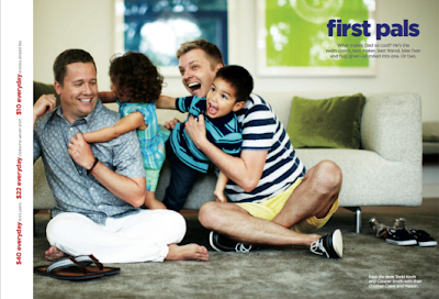
On the heels Birkenstocks of the company’s first Mother’s Day ad featuring a ‘two mom-ed’ household, comes a catalog spot that celebrates gay dads. 


Visibility and acknowledgement have long been a problem in the gay community. So when promoted alongside hetero-sexual counterparts, same-sex sells.

And while ultra-conservative groups like One Million Moms continue to condemn the retailer for promoting alternative lifestyles – we hope JCP will keep the gay coming.

Both ads are subtle enough that they fly below the radar of the quick skimmer. Still, JCP is slowly but surely exposing a more fidgety nation to the idea that the loving family next door can be non-conventional.  With repetition and other retailers joining the fold, hopefully these types of ads will soon be common place and feel “natural.” 

Just in case you missed the Mother's Day ad...
And while we’re on the subject of JCP…

Heavy Stat/Light on Tact

When newly appointed CEO Ron Johnson set out to rehabilitate the stodgy, aging retailer – he led the charge with a major overhaul to the company’s pricing strategy. But lately, it’s as if fair and square pricing has taken a back seat to campaigns that are pure brand.

And while JCPenney commercials of the last few months have been filled with rich, bright colors and video capturing the random playfulness of life – they haven’t reassured regulars that a retail world devoid of coupons can be good.

Perhaps JCP’s 15% miss against Q1 projections might have more to do with customer confusion than a lack of new brand resonance. It’s time to go back to basics and use commercial time to explain the new pricing strategy in more explicit terms.

The retailer should also fast-track legacy store renovation plans to bring drab, dim-lit in-store experiences up to match the fresh, new brand personality conveyed in the catalog and on TV.

Hang in there, JCP – you’ll find the right rhythm soon enough!